In the third post of our blog series, the online patient journey, we move from search and discovery to conversion. At this stage, with a good search, social and content strategy already created, you’ve worked hard to get prospective patients to your website. It would be a shame to lose those patients at this point. If your potential patient doesn’t take the desired action you want them to when they hit your landing page, your efforts have been wasted.
Your ability to convert visitors to qualified leads is heavily influenced by the performance of the content they first see on your website: The Landing Page.
In this blog post, we share some of our expertise in creating healthcare landing pages that capture attention and grow conversions (CRO).
If your potential patient doesn’t take the desired action you want them to when they hit your landing page, your efforts have been wasted
What is CRO (Conversion Rate Optimisation)?
Before we look at how to improve landing pages, let’s take a quick look at what CRO really means. CRO is the process by which making changes to your web page increases the % of website visitors to take your desired action.
The desired action may be signing up for a newsletter, booking an appointment or filling in a form – something that captures patient details so you can follow up and nurture them through their digital journey.
Why is CRO Important?
CRO is important because it enables you to continually improve the performance of your website as a marketing asset, and while a simple layout change might only give you marginally improved results, even a 0.1% increase in your conversion rate can dramatically impact your bottom line if you have a high enough traffic volume.
A good analogy is to think of your website as a garden - it’s not something that can ever be “finished” - it needs to be tended to and improved over time.
8 Tips for Creating Healthcare Landing Pages that Convert
1. Get your message across - quickly!
A landing page is exactly as it sounds – a website page which your visitor “lands” on after clicking a link from social media, Google, an email, a paid ad.
Typically these visitors will not be landing on your homepage, they will land on a page focused on the specific treatment or service that they are interested in.
When your visitor arrives at this landing page, you want to make sure you capture their attention so they stay and ultimately take a desired action.
Remember, your website is the digital representation of your brand, and just like when a patient walks through your door, when a patient lands on your website their first impression is incredibly important.
Studies show that you have 15 seconds to get across your core message before a website visitor is likely to bounce. There are 3 things you want to get across to the patient in the first 15 seconds:
Remember, your website is the digital representation of your brand
- Why should the patient visit you?
- What are you offering?
- Why should the patient believe you?
Why should the patient visit you?
What is it that differentiates your service from other healthcare providers? Is it your state-of-the-art facilities? Your multidisciplinary team? Perhaps it’s simply the ease of access to your location. Whatever it is, distill your points down into succinct, bitesize messaging and display it clearly on your page.
What are you offering?
Is the service relevant to what they were looking for? Going back to our example from earlier in the series: If David is looking for diagnosis on his back pain, but you have directed him to a generic diagnostic page with no mention of the back or spine, he has to do a lot more work mentally to understand whether or not your particular diagnostic services are right for him.
Why should the patient believe you?
Anyone can say that they are an internationally renowned expert on a specific subject. But why should a patient believe you? You need to back up your claims with social proof and trust markers. An easy way to do this is to display logos from the associations of which you are part of, or add client reviews and testimonials from verified review platforms such as Doctify or Top Doctors.
“‘Since we’ve introduced the new website, repeat clients have instantly noticed the improvement, and we’ve had positive comments about how much nicer and easier the site is. We’re seeing a lot of happy customers” Neil Osborne – Bella Vou - Marketing Manager
2. Clear CTA (Call to Action)
When someone arrives at your landing page, what do you want them to do? Really think about the aim of each page your website offers. Normally this will be to submit an enquiry or perhaps even book a consultation there and then but whatever it is you want your visitor to do on this specific page of your website, make it clear.
Your pages need to be easy to use, intuitive and clutter free. Think about the use of space and minimise distractions from your main CTA. It may be tempting to throw in as many CTAs and bits of information as possible but this can confuse visitors. Keep your page focused towards your goal.

3. Website Copy that Wows
Our medical copywriters are able to craft copy that is medically accurate, SEO friendly and persuasive. If you want to have a go at writing your pages yourself, try and keep these tips in mind:
- Confirm that the text on your landing page reflects what your visitor expects to read. If someone entered your site after clicking an ad which mentioned a specific type of pain, make sure the page they are served reflects their search exactly (e.g. lower vs upper back pain).
- Write relevant and engaging copy that demonstrates the experience of you or your staff, and focus on patient needs and problems.
- Use emotion when writing copy. You want your patients to feel safe, secure and reassured.
- Demonstrate how you can help and back up your claims with patient testimonials and reviews.
4. Mobile-Friendly is a Must
A whopping 44% of patients who research healthcare providers on their mobile devices go on to book an appointment. In the post-Covid world, it’s more important than ever to have a website which is mobile responsive and allows your potential patient to access information without being sat at a desktop.
Private healthcare provider, Circle Health, operate a number of hospitals in the UK. The majority of their website traffic comes from mobile devices. When we created their new website, we used responsive technology to deliver an engaging and intuitive user experience on both mobile and desktop devices.
5. Trust signals
71% of patients check provider reviews as a first step before booking appointments. When a prospective patient visits your website, they want to be reassured that you’re the right healthcare provider for their needs. Offer patient testimonials, case studies, stories and third-party review sites.
6. Frequently Asked Questions
Make sure that the answers to questions that you get asked most frequently are available on your website. For example you could consider adding an FAQ section on a specific page. It saves you time and effort responding to the same questions asked via email or phone.
7. Personalisation
Personalisation is a great way to make a website relevant to your visitors. Duplicating landing pages and tweaking them to cater to a specific audience can really help with your conversion rates.
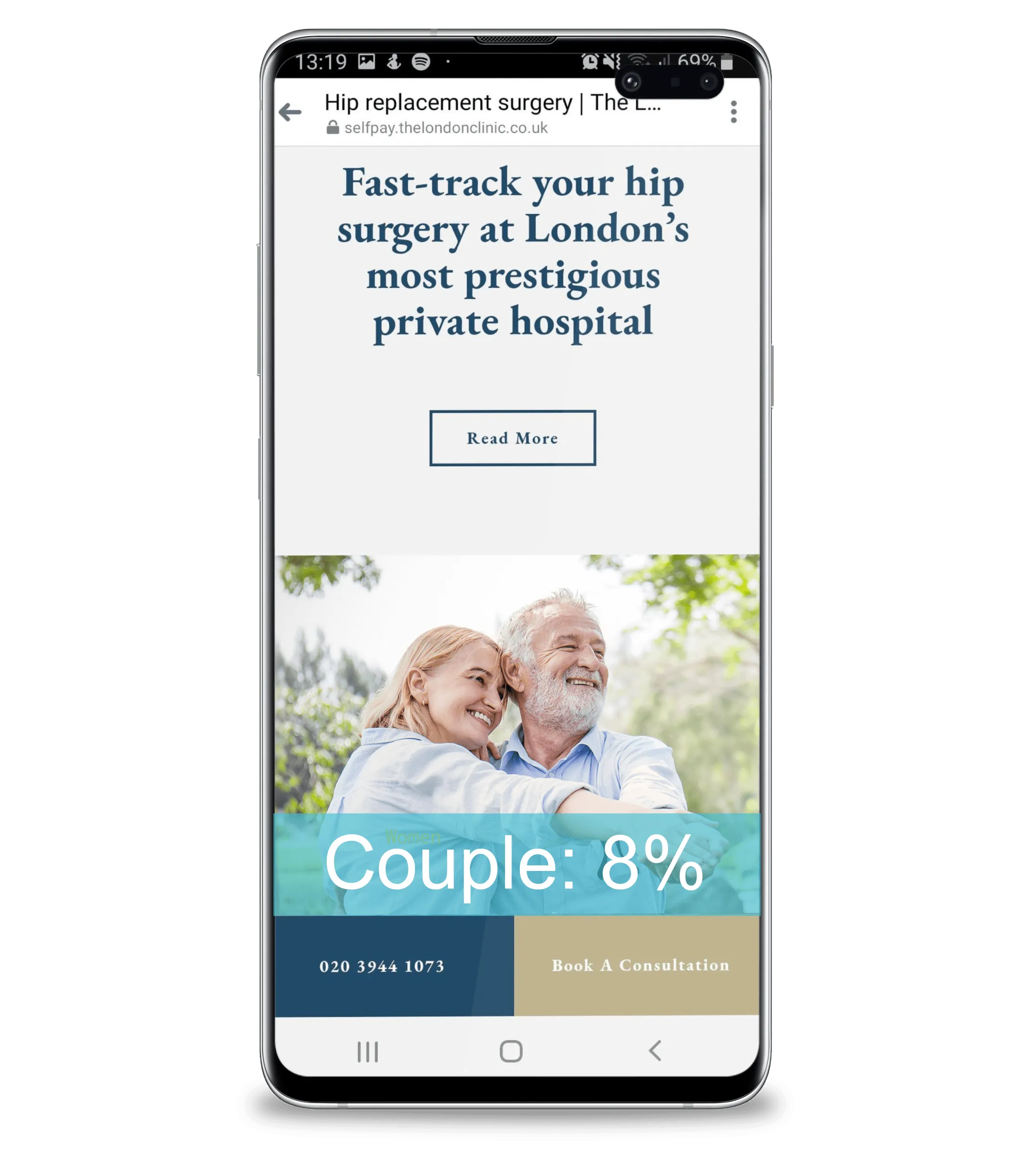
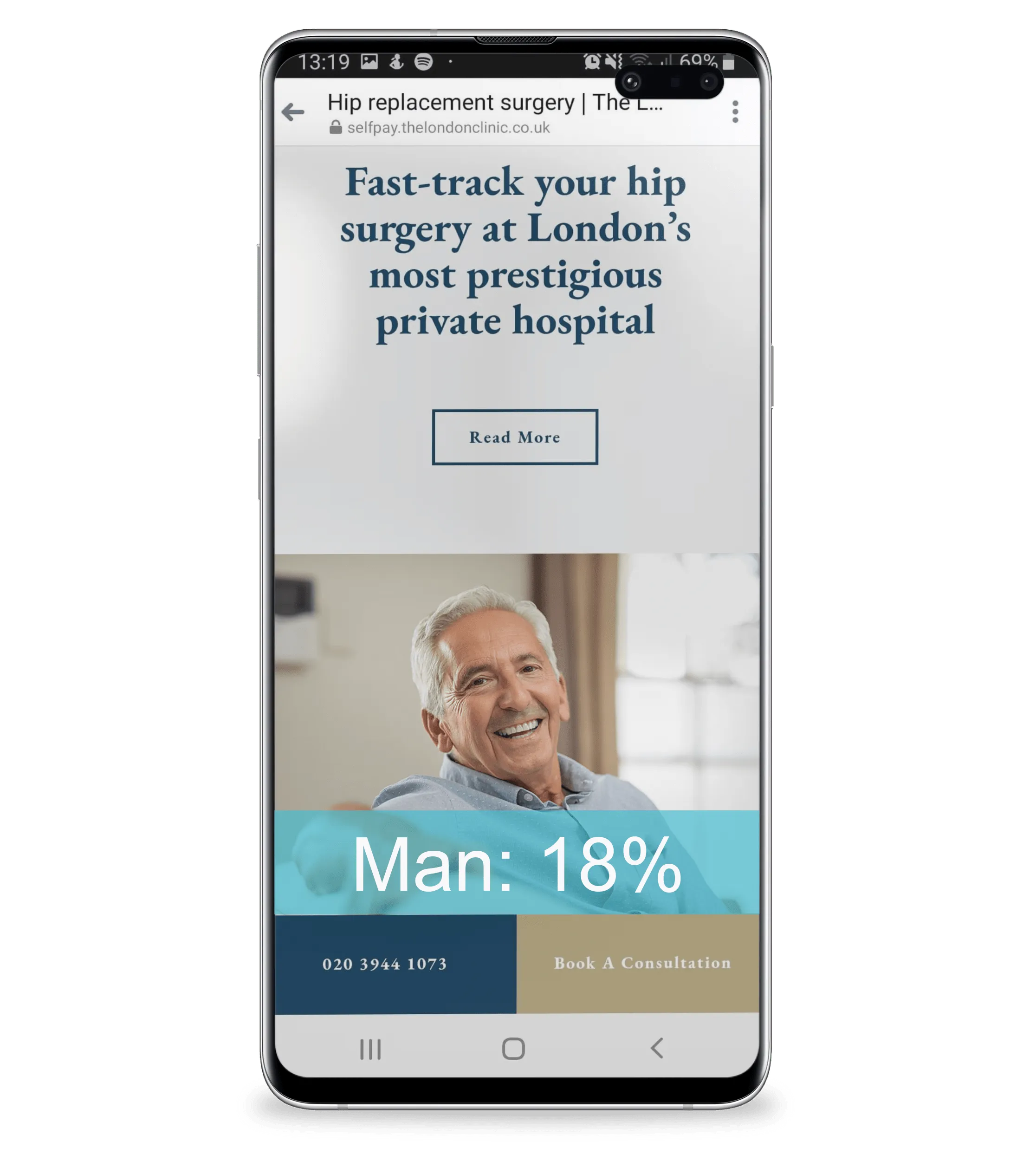
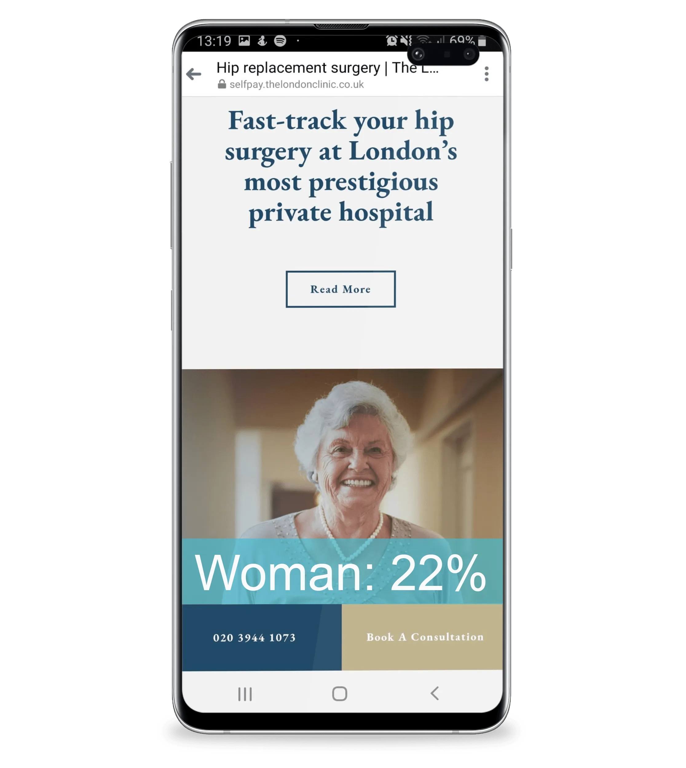
For example you might want to split some social ads between men and women, and then make sure the imagery on each page reflects this. The below example shows 3 variations of a landing page. The original page featured a couple and had an enquiry rate of 8%. When we split the targeting out by gender, and updated the image to reflect the target audience of men and women, the enquiry rate increased to 18 and 22% respectively. A simple change with a huge impact.
To take this further. think about a visitor’s age, geography and lifestyle. Aspects like colour, copy vernacular and layout of landing pages may seem trivial but can have a huge impact on your bottom line. For example we find that the over 65 demographic are much less likely to scroll to the bottom of a page than the 20-50 demographic. Therefore landing pages geared towards an older audience need to be better signposted, and the patient’s journey must rely less on vertical scroll sections.


8. Test and learn
It’s all well and good using your intuition to make changes to your website, but for a comprehensive CRO strategy, you must measure the outcome of any changes you make and use data to test and prove your hypotheses.
A/B testing on landing pages allows us to make fact-based decisions and understand exactly what resonates with our visitors. There are many aspects of a landing page which you can test, simply trying different text on your call to action button is a great start.
To test, learn and measure there are a number of great tools out there (both free and paid), from Hotjar’s heat mapping and session recording to Google Optimize’s innovative A/B testing, in this day and age there’s no excuse to not be making data-led decisions.
Sign up to our newsletter to follow our blog series the online patient journey. In our next post, we discuss the discovery phase of the journey and provide advice on how great copy will help position you as an authority in the online space.
