You’ll learn how to:
Understand your audience better
Write a great headline
Build trust
Make the reader take action
Read time: 7 minutes
Whether you’re writing for patients, healthcare professionals, or you’re soliciting donations for your charity couch to 10k - there’s only one criteria you should use when you judge the effectiveness of your landing page. It isn’t about how good it looks, or how well it’s written. It’s not about the sublime UX either. These things might help, but they’re a means to an end, not the end itself.
The only thing that matters is how well your landing page converts. If it gets your audience to do what you want them to do, it’s a good landing page.
But how can you maximise the conversion rate on your landing page? In this article, we’ll tell you exactly how it’s done. Firstly, let’s get the fundamentals down.
If your website is the airport, the landing page is the runway.
What is a landing page?
To put it simply, a landing page is the first page your audience “lands on” when they arrive at your website. If your website is the airport, the landing page is the runway.
In many cases, your landing page will be your homepage, but sometimes you might need to build different landing pages. For example, you may want to speak to a particular segment of your audience with a landing page designed specifically for them.
A landing page is your first chance to make a great impression on your audience. The aim is to ensure it’s not your last.
Okay great, but what’s a conversion rate?
A conversion rate is the proportion of your landing page’s visitors that take the action your landing page is designed to encourage. Maybe you want to get sign-ups for a newsletter you’ve just launched. If you get 10 visitors to your landing page and 2 of them sign-up, that’s a conversion rate of 20%.
Enough with the maths, let’s talk about how we can build a landing page that converts.
Who are you writing your landing page for?
Crucial to constructing a good landing page is understanding exactly who you’re constructing it for. We encourage clients to construct a persona breakdown of their audience by answering a set of questions, such as:
- Does your audience have plenty of disposable income or are they working within a tight budget?
- What typical age range are they in?
- How much do they already know about you and what you have to offer?
Get a clear idea of who you’re speaking to. Visualise them as you put your landing page together if it helps. It’s essential to know your audience intimately before you can even attempt to win them over.
Create a great headline for your landing page
Conventional wisdom puts an average website visitor’s attention span at around 8 seconds. If that wasn’t scary enough, only 20% of visitors will read beyond the headline.
In other words, the numbers aren’t in your favour. But a great headline can flip those numbers on their heads (we’re pretty sure numbers don’t have heads, but you get the idea…).
Writing a great headline means understanding how much your audience already knows about you. If they’re a warm lead (i.e. if they’ve landed on your website from a strong source, like a blog post or a referral from a previous patient), it’s likely they already have some understanding of what you have to offer.
If, however, they’ve found you through a relatively cold source (like a Facebook or Google ad), the headline will have to work harder to ensure any visitor to your landing page knows exactly why they should keep scrolling.
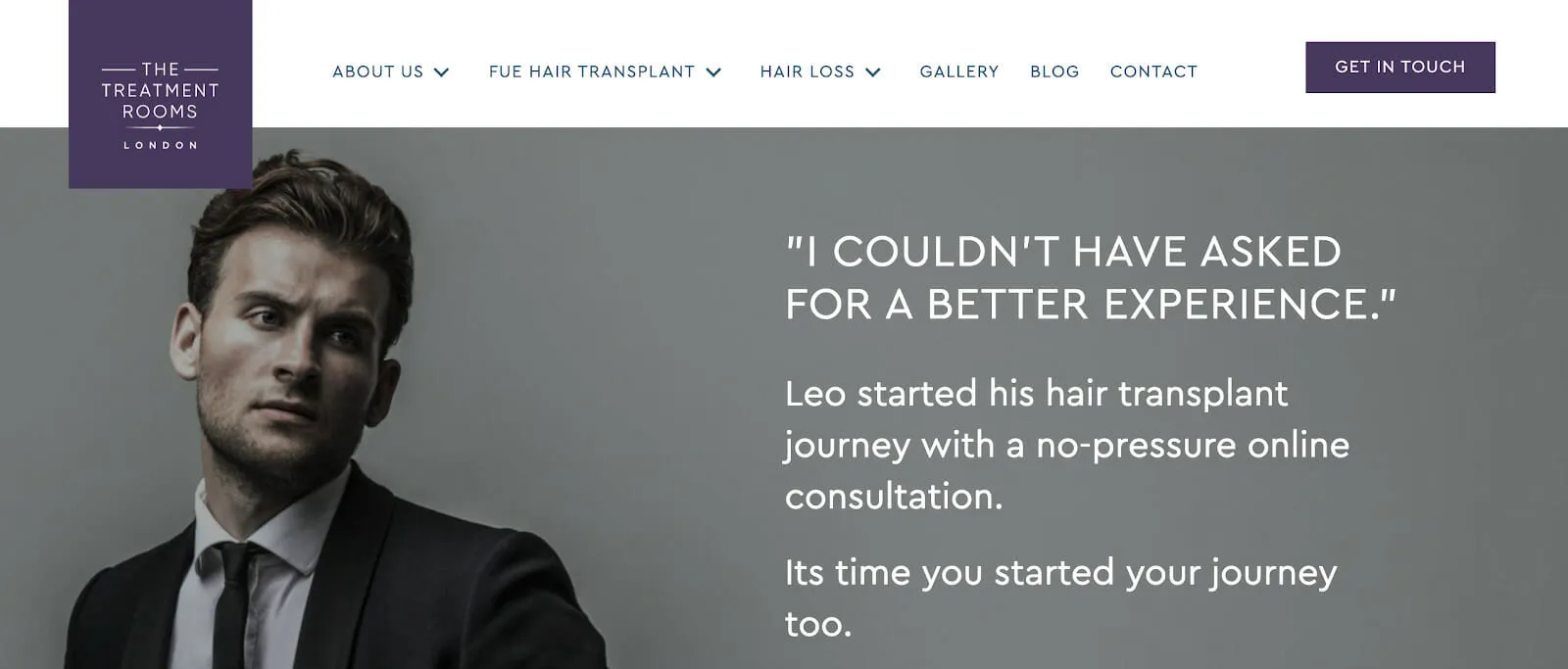
Here’s a recent landing page we put together for one of our clients, The Treatment Rooms London (TRL).

As this landing page was developed for a retargeting campaign we knew that anyone landing on this page would likely already have a fairly decent knowledge of the treatments that TRL provide. Therefore, our headline messaging focused less on educating our audience about what’s on offer, and more on building that all-important trust (more on that later).
Focus on encouraging a singular action
Time and time again, we work with clients that can’t figure out why their landing page is getting plenty of traffic but zero conversions. More often than not, it’s because they’re asking too much of their audience.
A landing page should have a singular goal. Maybe it’s to generate a consultation enquiry. Perhaps it’s to sign patients up to your newsletter. In any case, every element on that page should be working in harmony towards that goal.
The worst thing we can do is give our audience multiple call-to-actions. If you want people to sign up for your newsletter and directly book a consultation, you need two different landing pages.
The importance of building trust
In any field, but particularly in the medical industry, it’s essential to build trust with your audience. On a foundational level, this means your landing page should be professionally put together, typo-free and informationally accurate.
But to really establish trust, we need to build upon that foundation. You can do this via a range of methods: patient testimonials are a great start, as is referencing any media acknowledgement you might’ve received. Awards are also a great way to reassure an audience that you can be fully trusted to deliver on your promises.
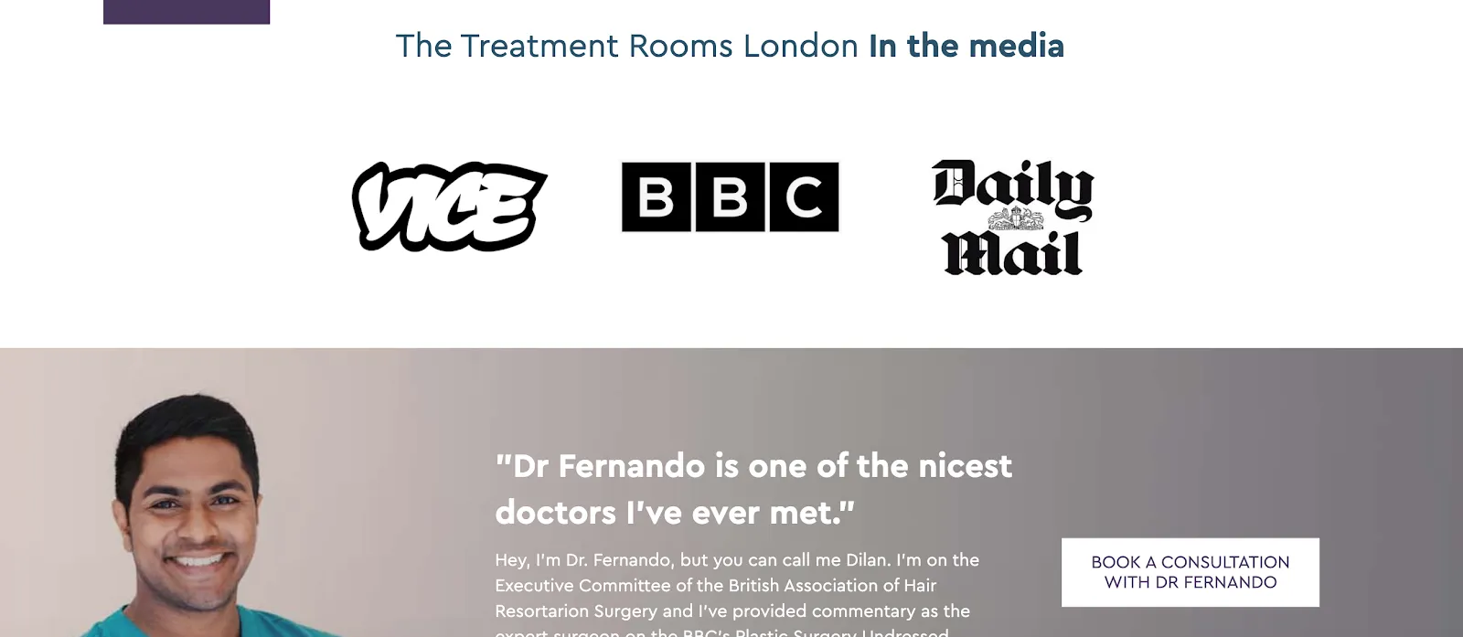
Let’s look at the TRL landing page we referenced earlier.

Here we made use of TRL’s brilliant Google reviews, and combined them with the mainstream media coverage they’ve enjoyed.
It’s a two-pronged approach: with the media mentions, we reinforce the idea that TRL are industry leaders. By following it with a customer review, we add a personal touch. The message is clear: this is a business that is both respected by the industry and recommended by the consumer.
This trust building continues throughout the page (the sharp-eyed readers among you may have noticed that we actually used a testimonial as our opening gambit at the top of the landing page).
Your landing page CTA
Think carefully about your call-to-action. What exactly are you asking your audience to do?
In the medical industry, it’s unlikely that the product/service on offer is the sort of thing purchased on a whim. More often than not, a purchase in this field comes about through careful consideration.
As such, introducing a pre-purchase step might be prudent.
In the case of The Treatment Rooms, we decided that encouraging audiences to book a consultation should be the sole purpose of the landing page. It’s a relatively low-effort action for the consumer, but it yields a powerful lead for the client.
Whatever you decide on for your CTA, ensure that completing the action is as easy as possible. If your landing page visitors have to complete a 3-page form, you won’t see great conversion rates. Equally, UX issues like a buggy email field or a faulty payment system will severely impact your ability to get prospective customers over the line.
Remember, you’re competing for your audience’s attention. Make sure you don’t give them the opportunity to look elsewhere.
This is worth repeating.
Your audience shouldn’t have to work to find out how to take action. That responsibility falls on your shoulders. When a visitor to your landing page has been won over, it should be clear and obvious what they need to do next.
That means regular, conspicuous CTAs, clear and uncluttered formatting and, in almost all cases, a frugal approach to the amount of text on the page.
There’s enough distraction and noise on the internet. Your landing page should be an oasis, focused solely on accomplishing one aim: to convert.
The power of trial and error
Finally, it’s important to frequently test and tweak your landing page. Monitor results vigilantly and adapts accordingly.
The more detailed your analysis can be, the better. For example, perhaps you’ve noticed that users spend an average of 30 seconds on your landing page before leaving. That might suggest that your landing page needs to be more concisely formatted, or that the content that proceeds the headline isn’t retaining attention in the way that it should.
We like to treat our landing pages like we treat our houseplants. Check on them frequently, tweak them when needed and give them a bit of love. They’ll continue to grow your conversion rates accordingly.
